Metrics that Matter

Objective: Re-design the performance management dashboard to become the single source of truth for the Digital Commerce Team, which is smart, automated, and inspires cross-collaboration between the global, country, and functional teams within a CPG Digital Commerce organizational ecosystem

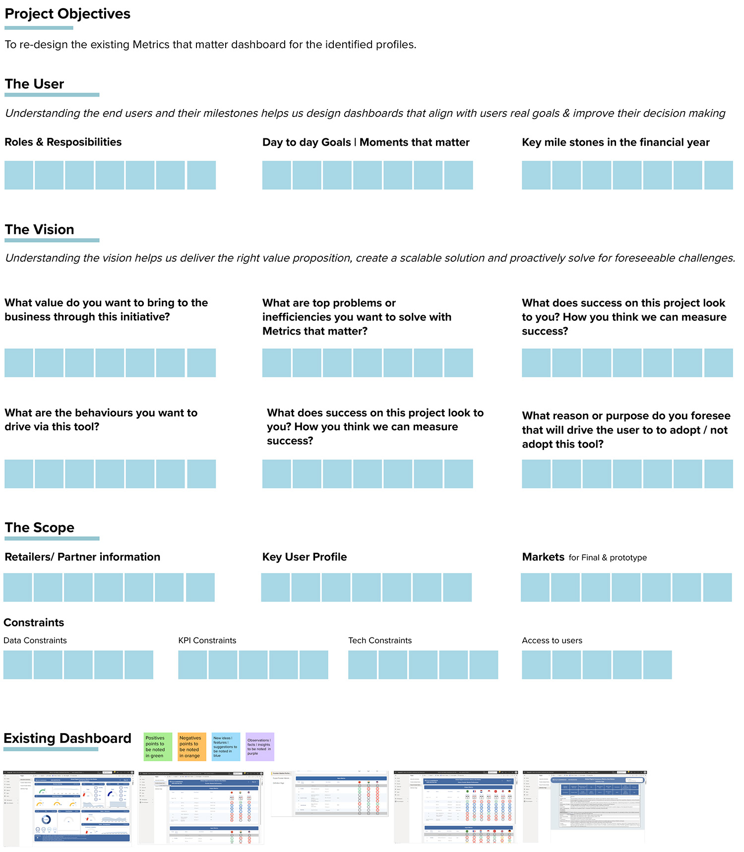
Approach: We conducted a kick-off meeting with the Digital Commerce leadership to get an in-depth understanding of the business goals & project alignment. We followed this with 10 immersion sessions with other leadership & function teams to understand user needs. Recurring themes, pain points, and opportunity areas were converted into How Might We statements for internal and client/team ideation sessions. In addition, we built user personas, conducted prior mapping and feature component mapping sessions in close collaboration with the clients, developers, and data team. Feedback sessions with multiple stakeholders, future roadmap, co-creation with PowerBI developers, and product life & growth were other initiatives to render a holistic and robust end solution.

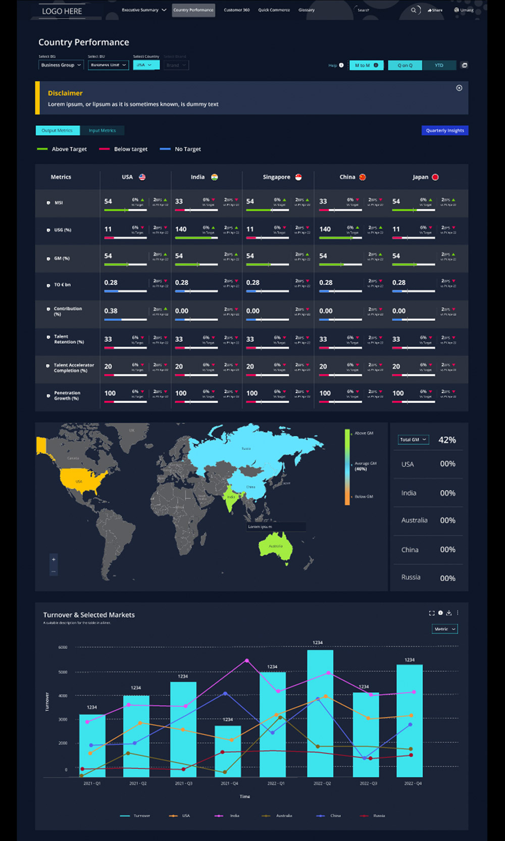
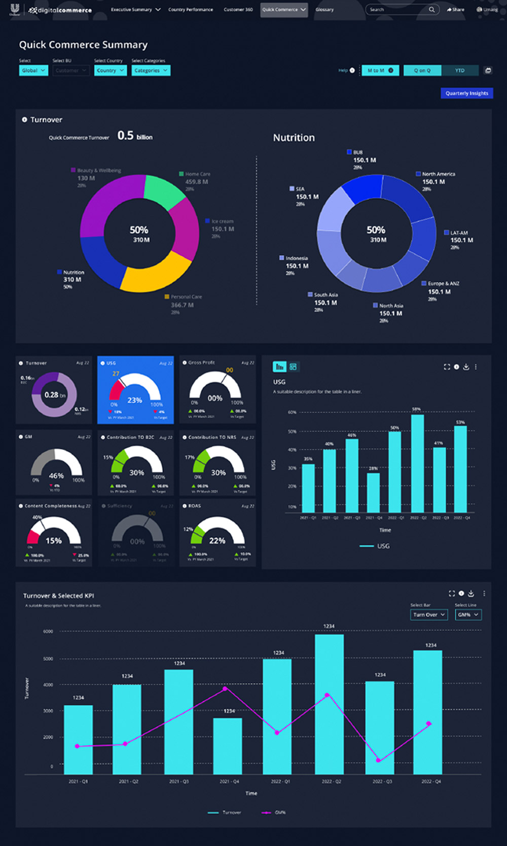
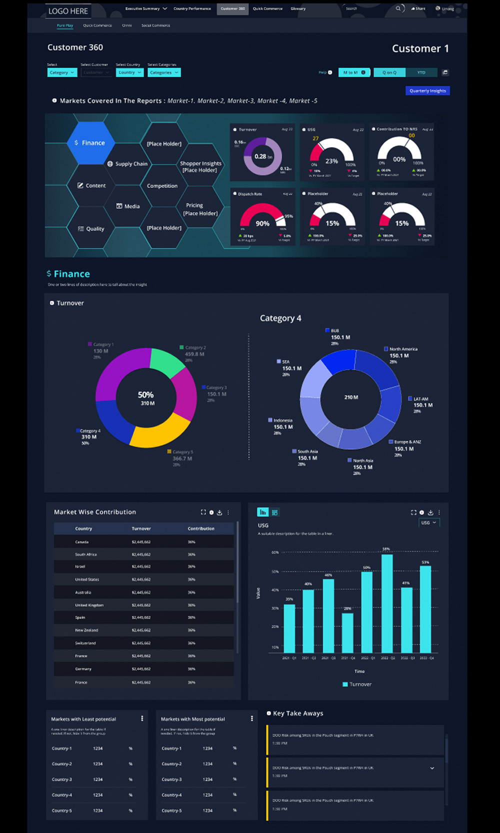
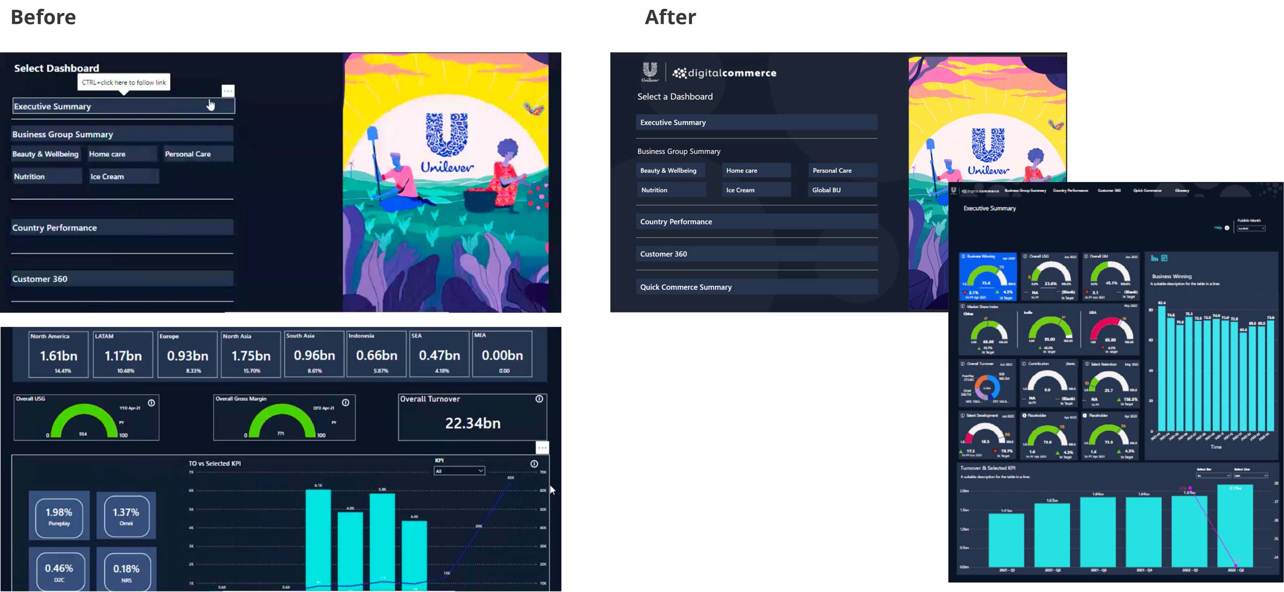
Solution: Re-design of the Executive View & Business Group (BG) Overview of the performance management dashboard, Re-design of the Country Views, Create Customer 360 View (pure play customers), and Create Quick Commerce view: Summary & Customer 360 View.

Learnings: We could have spent more time getting an in-depth understanding of KPIs / metrics / cross-functional KPIs and visualizing the data. We should get complete visibility on the data availability before committing to a deliverable, address the data gaps and delays from the client’s end, and the effect on timelines.

Time: 9 weeks

Role: Senior User Researcher

Team: Experience Team, Data Engineering, Development Team

Design Process

The project was broadly divided into 3 phases:

Immersion & Discovery
Synthesis & Analysis
Ideation & Develop
  • Developed an initial understanding of the problem
  • Immersion sessions
  • Evaluation of existing dashboards
  • User persona building
  • Insight & opportunity areas identification
  • Feature component mapping
  • Ideation workshop & Priority mapping
  • IA & Wireframes development
  • Feedback Sessions
  • UI & Style guide development
Immersion & Discovery

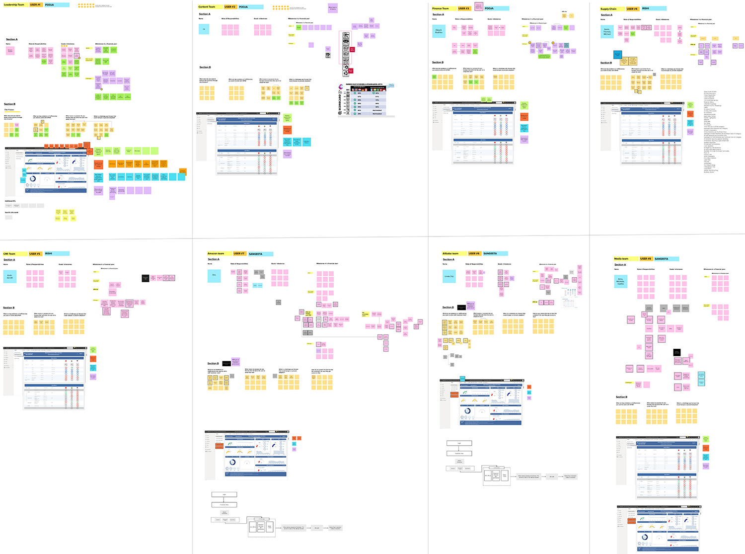
We conducted 10 immersion sessions with leadership & function teams to understand the user needs, pain points, and unmet needs. I designed the frameworks, co-conducted and facilitated the sessions.

Key Takeaways from the Immersion & Discovery Phase
Values
  • A tool to show correlations
    across different functions
  • Snapshot tool for the leadership teams
  • Tool to empower BG / BU to make business plans & strategies
Challenges
  • Build trust in the platform
  • Enable ease of communication
  • Address adoption barriers
  • Standardize definitions
Inefficiencies
  • Waiting for monthly performance reports
  • Lack of visibility into data availability, frequency, ownership & source
  • Data currently viewed in isolation
Synthesis & Analysis

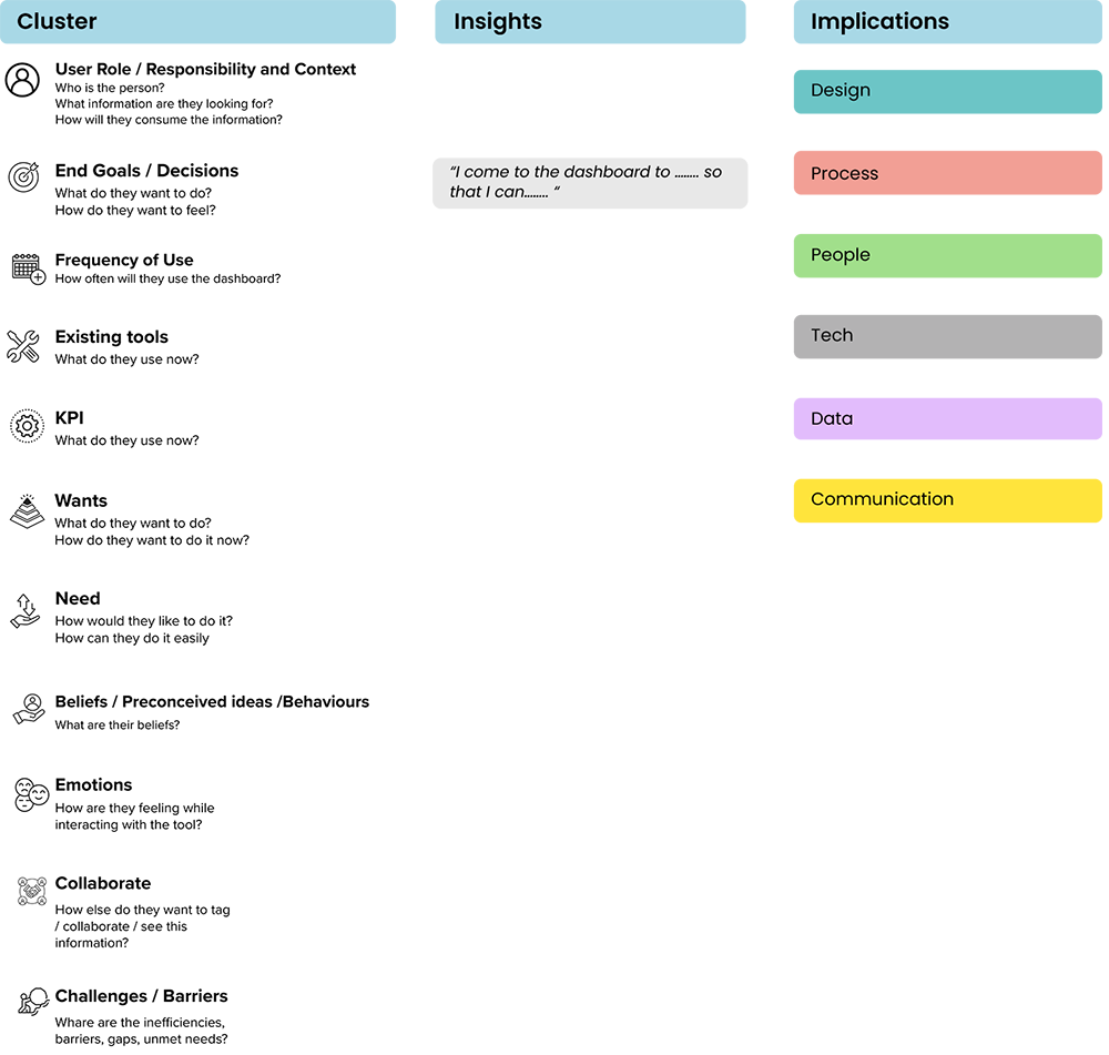
Synthesis Framework

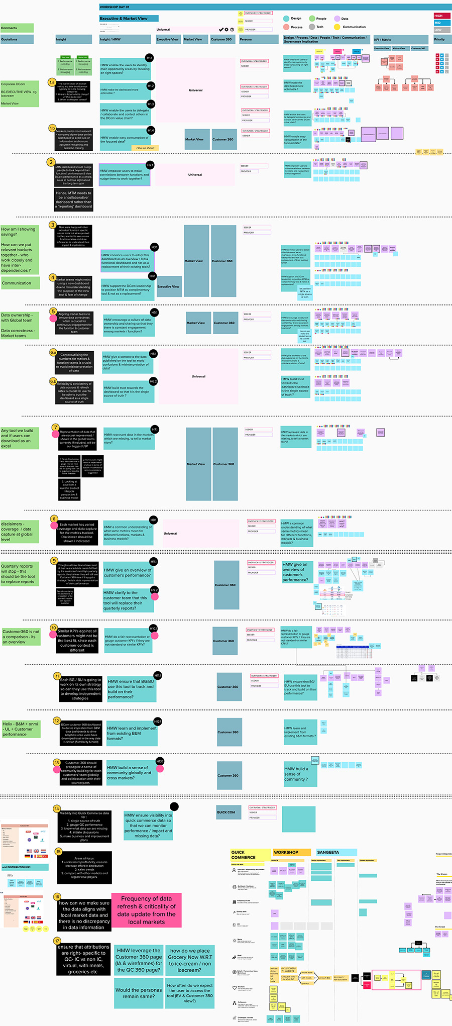
We had a lot of information from the immersion sessions. I built a framework to help the team synthesize and generate insights.

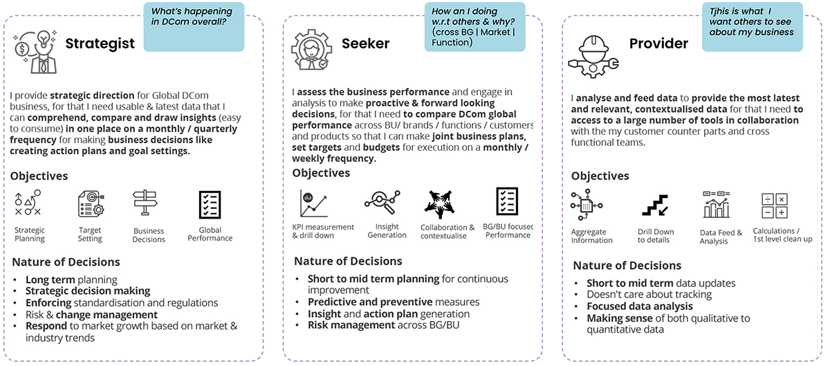
User Persona

The personas were built based on the purpose of use of the tool and their motivation to use it. All user profiles that we met wear multiple persona hats while using the tool, based on when & why they choose to visit. Each persona has been mapped to Insights & their subsequent implications to ensure that we do not miss on their distinct needs while building the solutions

Analysis Framework

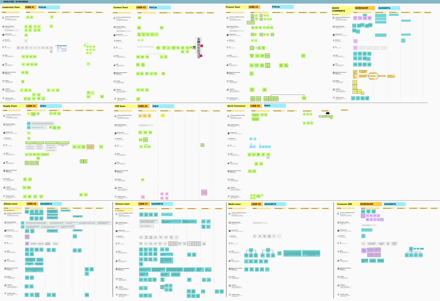
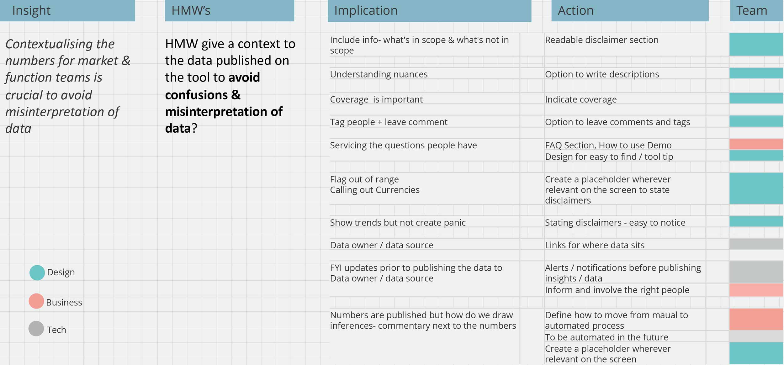
Now that we had a clear idea of the user personas and emerging themes from the synthesis sessions, we started to analyze all the information. We decided to do this in 2 steps. Step one would be an internal analysis within the design team. Step two would be to share our analysis with the clients, engineering, and data team to get their validation and alignment. I created the framework to help the team ideated effectively, and collaborated with the team to build How Might We statements.

Overall Analysis & Synthesis

Reframed Objective of the Tool

We realized we had the go beyond just redesigning the screen. We had to tackle and solve for other the following challenges:

Breaking Siloed Approach

Strong Value Proposition & Cross Functional Views

Build Transparency & Trust

Showcase cross-functional views to enable users to make correlations between functions and work in collaboration with each other.

Tool to be looked at as an additional overview/cross-functional dashboard and not as a replacement for their existing tools.

Avoid confusion & misinterpretation of data, leading to a lack of trust in the tool.

Simplification: Less is more approach

Encourage Collaboration

Built for Future Growth of the Tool

Enable identification of opportunity areas in a sea of information through a simplified and user-centric approach

Encourage BG / BU to use the tool to track and build on their performance

Build for an increase in the sophistication of the platform, increased data availability, and increase demand for enhanced user communication

Ideation & Develop

Ideation Framework

We ran multiple ideation, co-creation,  and rapid prototyping workshops with the clients and the extended team to brainstorm actionable solutions. We took the implications from the earlier phase to move into the solution phase.

UX Strategy: 6 Design Principles for the Dashboard
Data to tell a Story
Qualitative & Qualitative Insights
Enable self-service & self-analysis

Identified and visualized which KPIs should be looked together in a single view to enable the user to draw inferences & insights easily

We added an insight section for qualitative reports and custom insights, in the future this would be automated

Users can view & download data in different formats as per their preference.

Visibility & Proactive
Build for the growing DCom Ecosystem
Bridge the gap between the Client & their Customers

We showcased missing data in grey, data being worked as coming soon & existing data with relevant disclaimers to build trust in the platform

Defined the Future Product Roadmap for an increase in sophistication, transparency & communication in the platform

Build for an increase in sophistication of the platform, increased data availability, and increase demand for enhanced user communication

Develop

Information Architecture

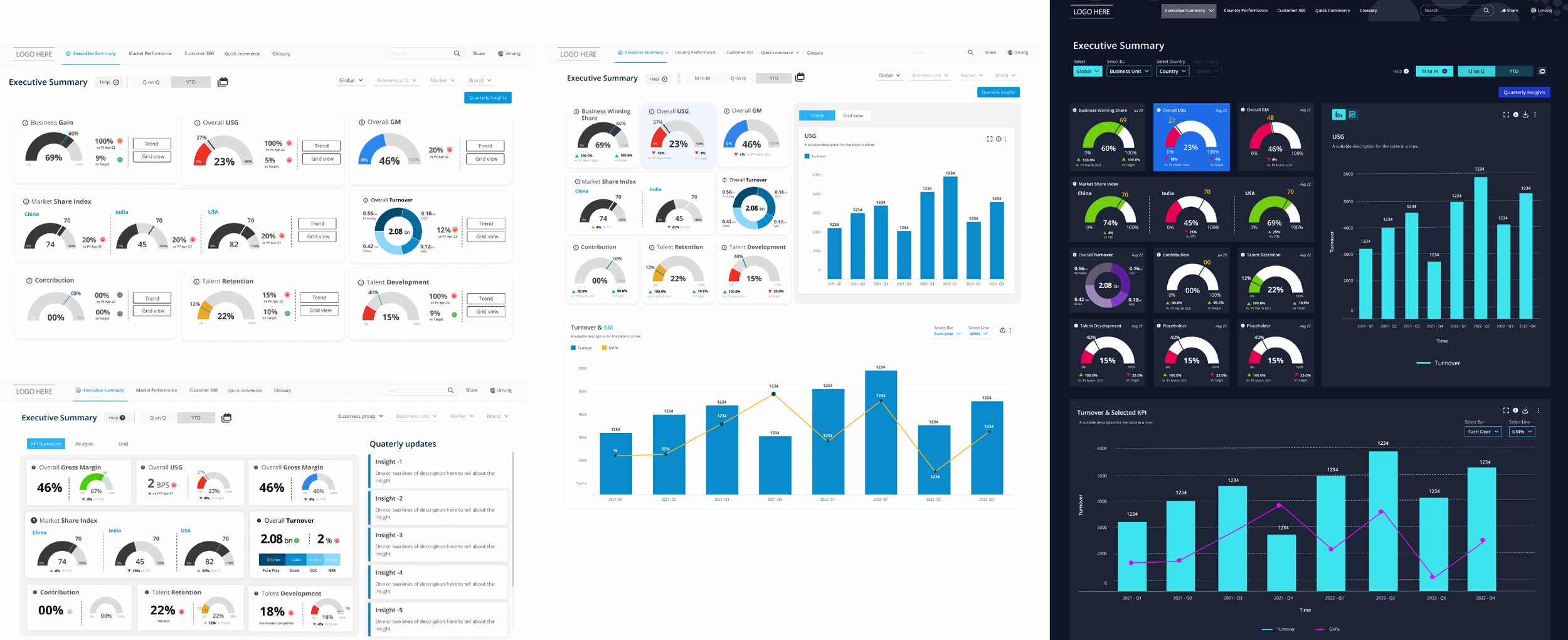
Wireframes Development

We iterated based on the feedback from the clients, potential users, and developers of the platform.

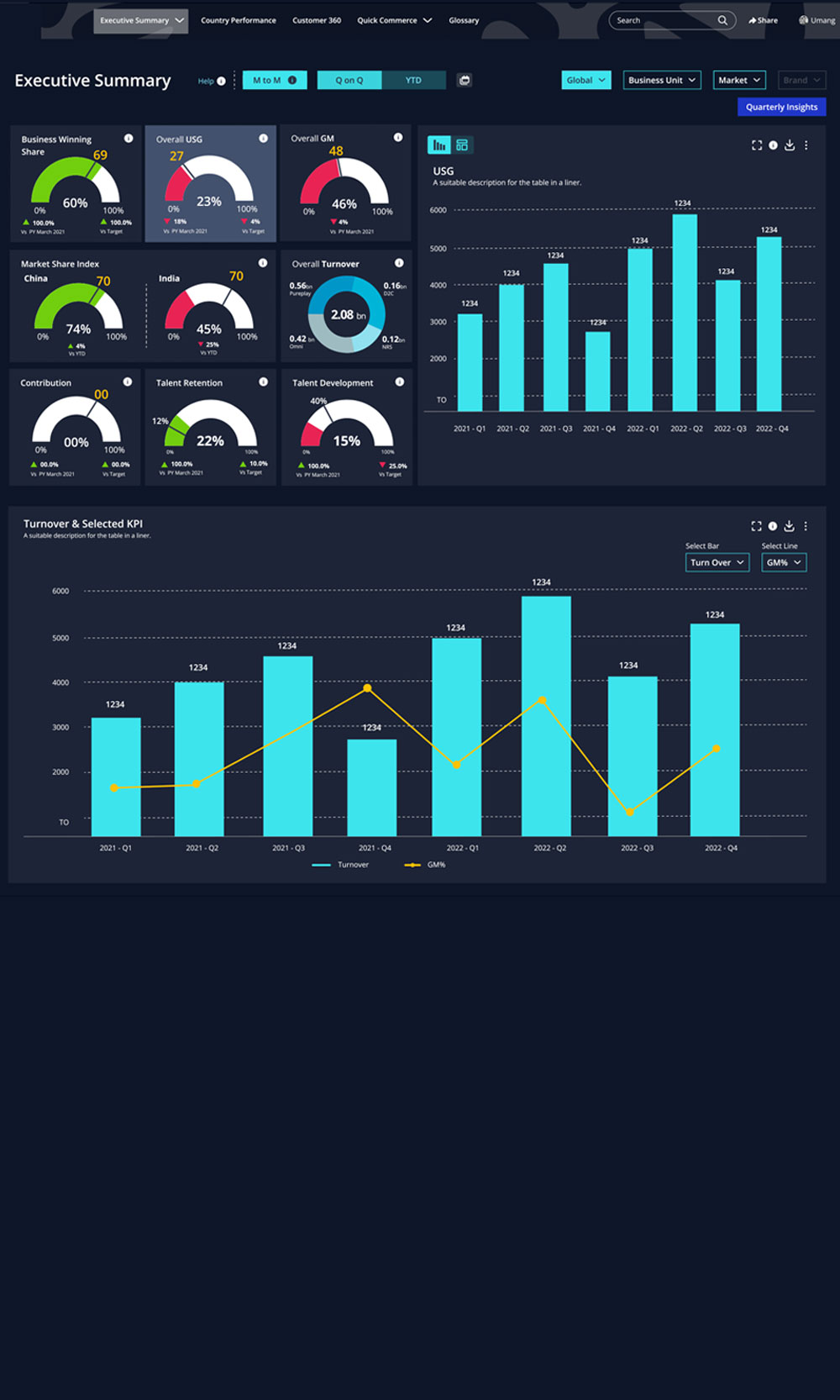
UI Snapshot

Executive View

BG Summary

Country Performance

Quick Commerce Summary

Customer 360

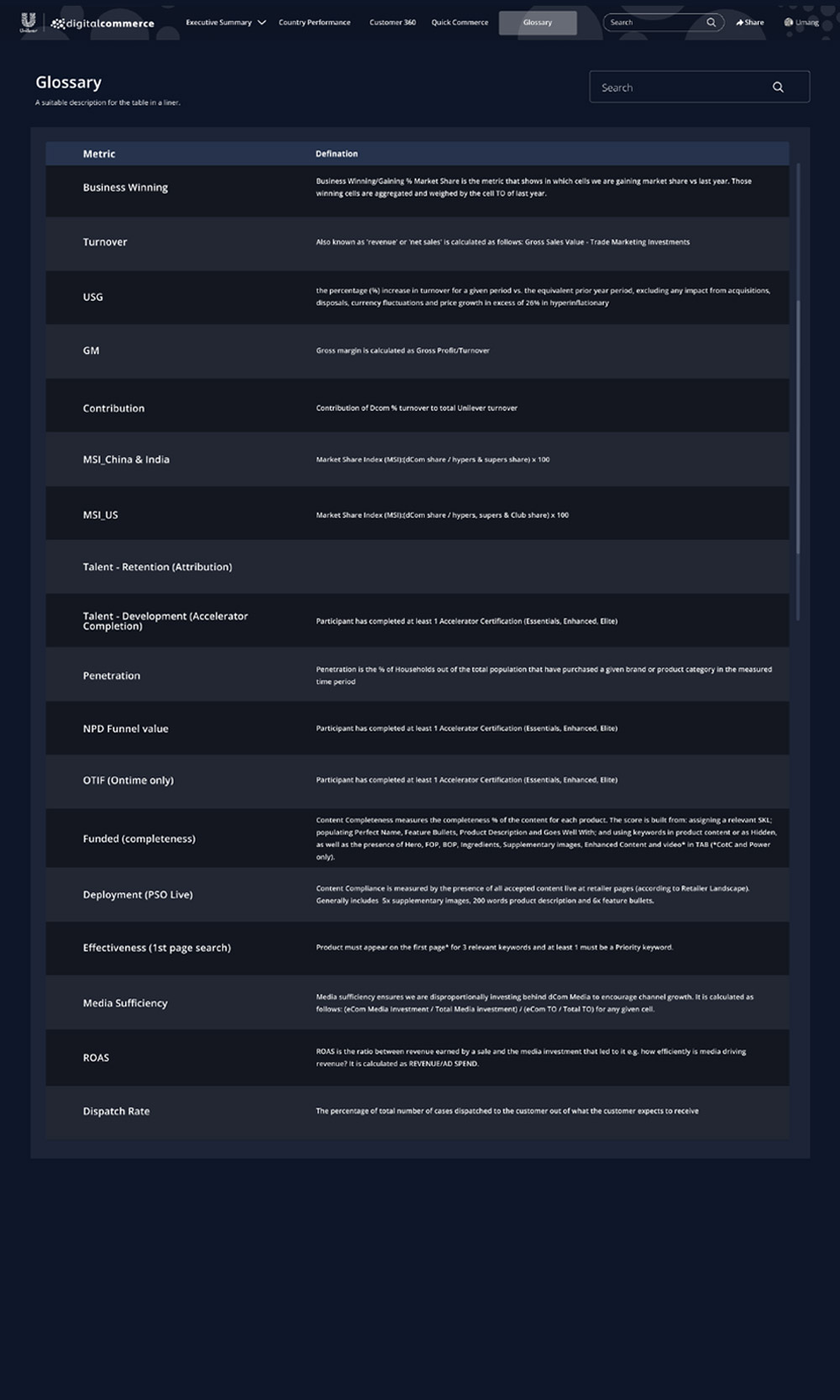
Glossary

Co-creation with Power BI Developers

We collaborated with the PowerBI developer to produce pixel perfect mock-up screen.

Client Feedback:

“I presented the dashboard to the Global Digital Commerce Leaders in the QBR, last week. There were 50+ leaders on the call. The members were awestruck, excited, and literally sitting at the edge of their seats waiting for the tool to be launched. We were bombarded with appreciation, feedback, and suggestions. Yesterday, we presented to the Global Community of Practice of 800+ Digital Commerce members. I hear that they were flooded with appreciation.”

“Team, I wanted to build on the inspiring note from Bel and simply say thank you…I am in awe of what this team has built and immensely proud of what you have collectively achieved as a team…you have all lived by the ethos that…the strength of the team is each individual member but the strength of each member is the team. Be proud and let me know when we can talk about MtM 2.0 (and 3.0).”

Reflection

We could have developed better brainstorming methods for visualizing the data with the whole team. Rapid prototyping with the clients is a must.

Address the data gaps and delay from the client’s end and the effect on timelines

We as a team should get complete visibility before committing to a deliverable

An added week, in the end, to tie up loose end could be a good way to address any additional needs the clients may discover during the design process.

Impact

Projected to be used by 800+ people in the Digital Commerce Business across 5 BG/BUs & different geographies.

We went beyond designing the UX & UI of the platform. We defined along with clients a detailed, exhaustive, & comprehensive Future Product Roadmap to accommodate for the increase in sophistication of the platform (eg: integration of yammer, predictive forecast ability), increased data availability/visibility, and increase demand for enhanced user communication (eg: Comment leaving, tagging, running simulations).

The discovery phase outcome also helped us & the client to realize the gap in data availability, in addition to identifying opportunities w.r.t experience design. This assisted in managing data expectations, highlighting the fundamental and pragmatic challenges and also phasing of the product life and growth.

Privacy Settings
We use cookies to enhance your experience while using our website. If you are using our Services via a browser you can restrict, block or remove cookies through your web browser settings. We also use content and scripts from third parties that may use tracking technologies. You can selectively provide your consent below to allow such third party embeds. For complete information about the cookies we use, data we collect and how we process them, please check our Privacy Policy
Youtube
Consent to display content from - Youtube
Vimeo
Consent to display content from - Vimeo
Google Maps
Consent to display content from - Google